When I started this company, I chose the name Expanse because I liked it. Expanse means a wide continuous area of something and software is a very big world. There are so many possibilities with software and I thought Expanse was the perfect name. At that time, I was already searching for a good name. However I’m a perfectionist so a lot of the names I brainstormed just didn’t feel right. When Expanse popped up in my head it did feel right.
The trouble already started when I started designing the brand identity (logo and colors). I could come up with a decent icon but the four colors used where kind of random. Less colors didn’t work, so I adjusted the colors a bit and went with those. I also couldn’t make the text of the name (Expanse) look good next to the icon. On the website I’ve used a version with a font that made it work but only on the small scale. I’m not a brand or logo designer so that probably has to do a lot with why it didn’t work. In the meantime I was working on a project, so I didn’t have a lot of time to play around with it and I just went with it.
How pointers came to light
However a few weeks back I was searching for a domain for a project and the AI suggested an unrelated domain called Binary. When I read it, it just felt right. It’s short, memorable, has meaning in the software world, and I could imagine making a good looking logo for it. However as with all good names, all domains where already taken. If I can remember correctly, I could buy binary.nl but binary.agency was taken. I started brainstorming a little bit and came up with related words.
Vector, Refactor, Dependency, Heap, Pointer, Evolve, etc. I checked domains for every word and wrote down the words that had a good meaning related to software. I tried to design some logo’s for it and played around with the words. After a while I started to like Pointer. However, the domains where already taken, so I didn’t pay a lot of attention to it. I can’t remember how I came about the name Pointers, probably just added an s when playing around with it, but it stuck.
A pointer is a variable that stores the memory address of another variable as its value, and pointers is just the multiple of that. It sounded nice, and can be pronounced easy in both English and Dutch. So I bought https://pointers.agency and moved on to designing a new brand identity.
How I designed the brand identity
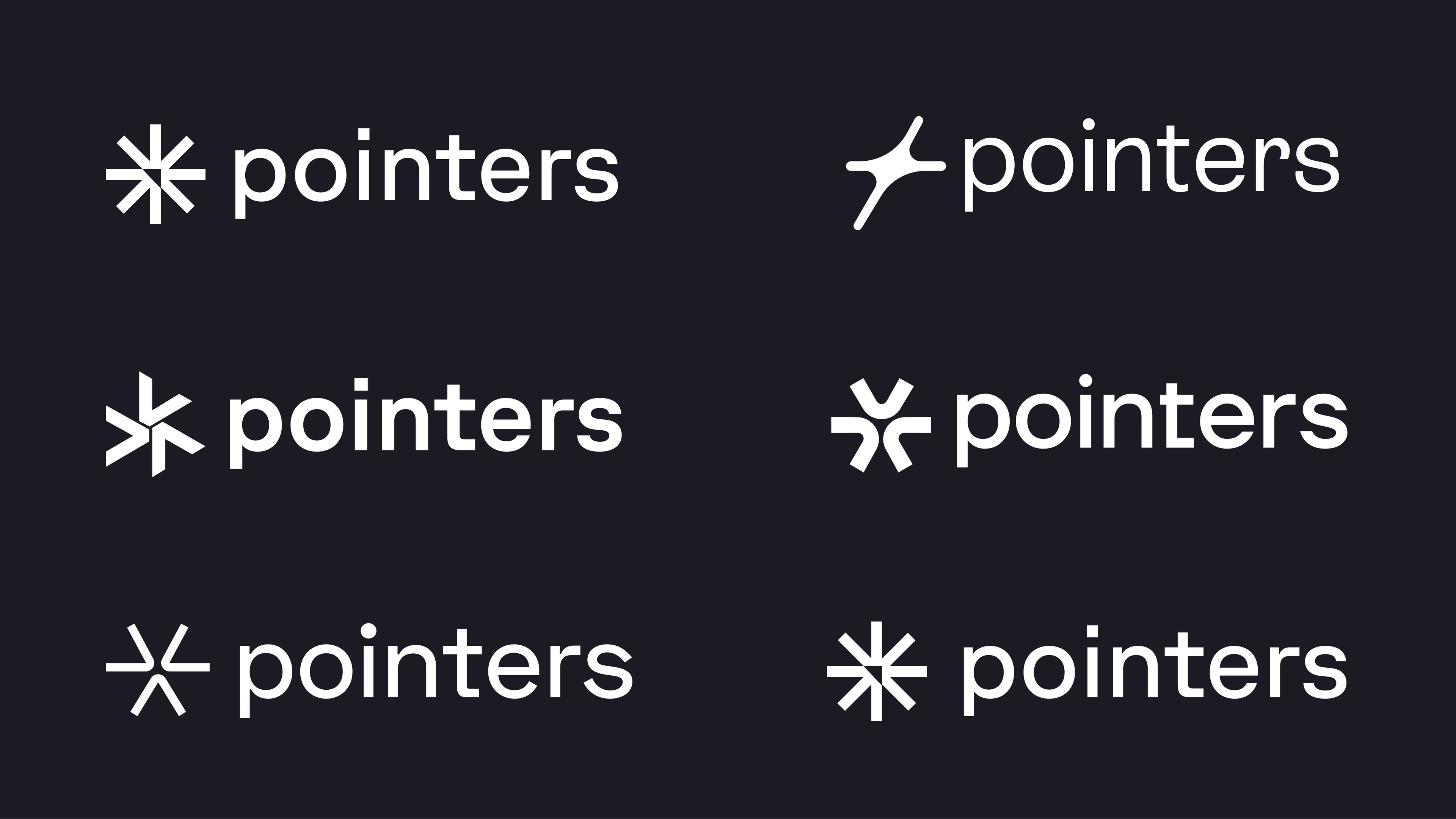
I’m by no means a brand designer, but for my own company it gives me the control I need. I usually start by smashing some colors on a canvas in https://figma.com along with symbols/icons for the logo. Because the end result is already in my head, I don’t have to write a full brief. Sometimes I make moodboards but usually just playing around with colors, fonts, and symbols is the way to go. You get a feeling of where you want to go and what you don’t like.
The first one looked the best. Simple, looks like a pointer, matches the style I’m going for, and feels just right. I didn’t like the font, so I took the font of the 5th one and compared it. I like the square feel of the font and it matches with the square feel of the icon. I added a little bit of spacing, adjusted the font weight and the stroke width of the icon to match each other.
Picking the colors
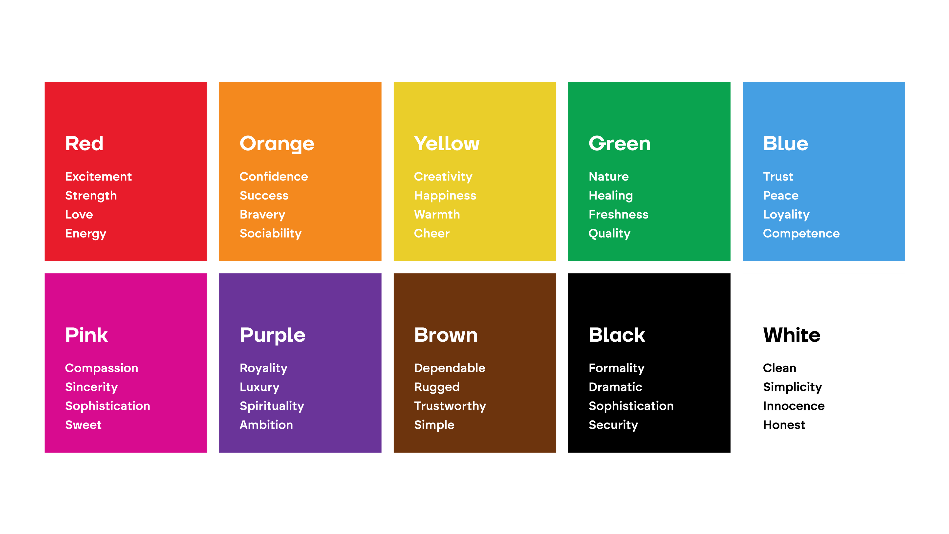
The colors were a little bit more challenging. Colors are quite hard to get right and I didn’t want to make the same mistake of choosing to many (random) colors. So I explored quite a bit of color schemes. Did you know that every color has it’s own feeling. You can see that in this scheme:
When I was playing around with colors I came across #c0b9df which is now my primary color. I like the feel, it feels soft but also strong at the same time. From the primary color I created the secondary color #c7d8c5. Two colors are usually enough, I complemented them with basic black and white.
What this all means
Not very much. Our look and feel is different, but on the inside we are still the same company. We keep designing and building software, just under a different name. The only thing that is going to be different is our social presence. We have some fun and interesting topics to blog/post about.
Especially with the AI development, everything is going so fast. It’s the best time to invest in any kind of software for your company. The possibilities are now actually almost endless. We’re going to write about this soon, so keep updated and have a good one!


