User experience (UX) is very broad domain. It is used in many industries and it’s meaning is different depending on who you ask. We will look at the digital design aspect of User Experience. Especially in the design industry the focus is mostly on good looking interfaces instead of useful interfaces. This isn’t necessary a bad thing, we want interfaces that look pleasing, but sometimes the interface doesn’t match the actual problem they are solving.
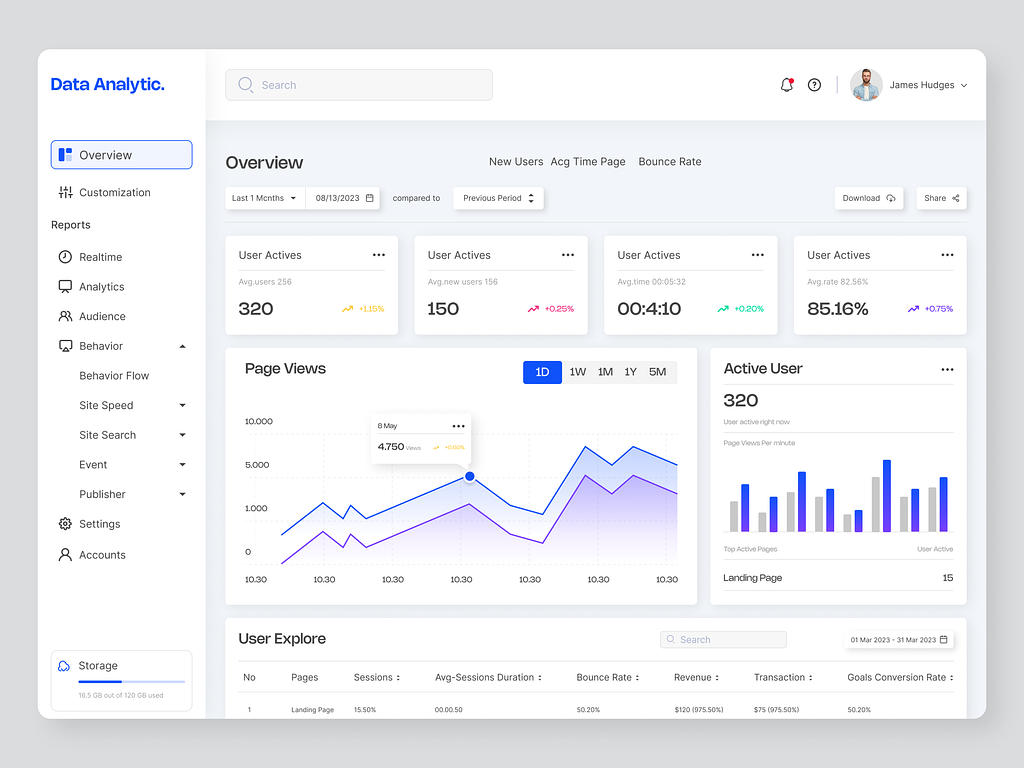
Let’s look at an example. The issues arise mostly when designing data intensive applications. When you focus on how it looks instead of usability you create more problems then you solve. If you look at the design below by Webflix, you’ll see an interface that looks good (minus the extreme shadows but that’s for another time). But what if I asked you what the most important thing in this dashboard is. Can you answer that?
The UI is confusing. There isn’t a clear hierarchy of elements, so an user would be confused. This is UX. You have to feel it to actually understand it. As users we don’t want to think, we are there to solve a problem. When you focus on beauty instead of solving that problem, you get bad UX. And no, good UX does not mean an ugly interface. Good UX just means there is a reason behind every element and it’s location instead of filling up the UI with random elements because it looks good.
“Any product that needs a manual is broken” - Elon Musk
Key elements of UX design
Traditional approaches involve doing user research and understanding their needs, information architecture, accessibility and inclusivity, and more. I don’t take that approach. These approaches are mostly done by big companies who got convinced this is how it is done. When you want a fast but efficient approach, you can’t afford to spend much time on certain task. So, I made it simpler.
Getting clear on the problem
It always starts with the problem you are solving. Every digital product solves a problem. So the users of that digital product (you or others) expect that that problem is solved. Sometimes you don’t know exactly what you’re solving, you just have an idea. That idea has to become a detailed problem with a detailed solutions (the digital product).
When your problem is vague, your product will be vague. If you want to measure how many users are active on your website and the dashboard shows all kinds of data that isn’t relevant to fill up the dashboard page, the product failed. The first thing the user should see, is how many users are active on the website. You probably also want to see how many users where active on any time of the day, so a graph beneath it will solve that. What is more important, where your users come from (country/ip/referrals) or what page they visited the most? I would prefer the last one. So now we already have a basic interface hierarchy.
Sketching the user flows
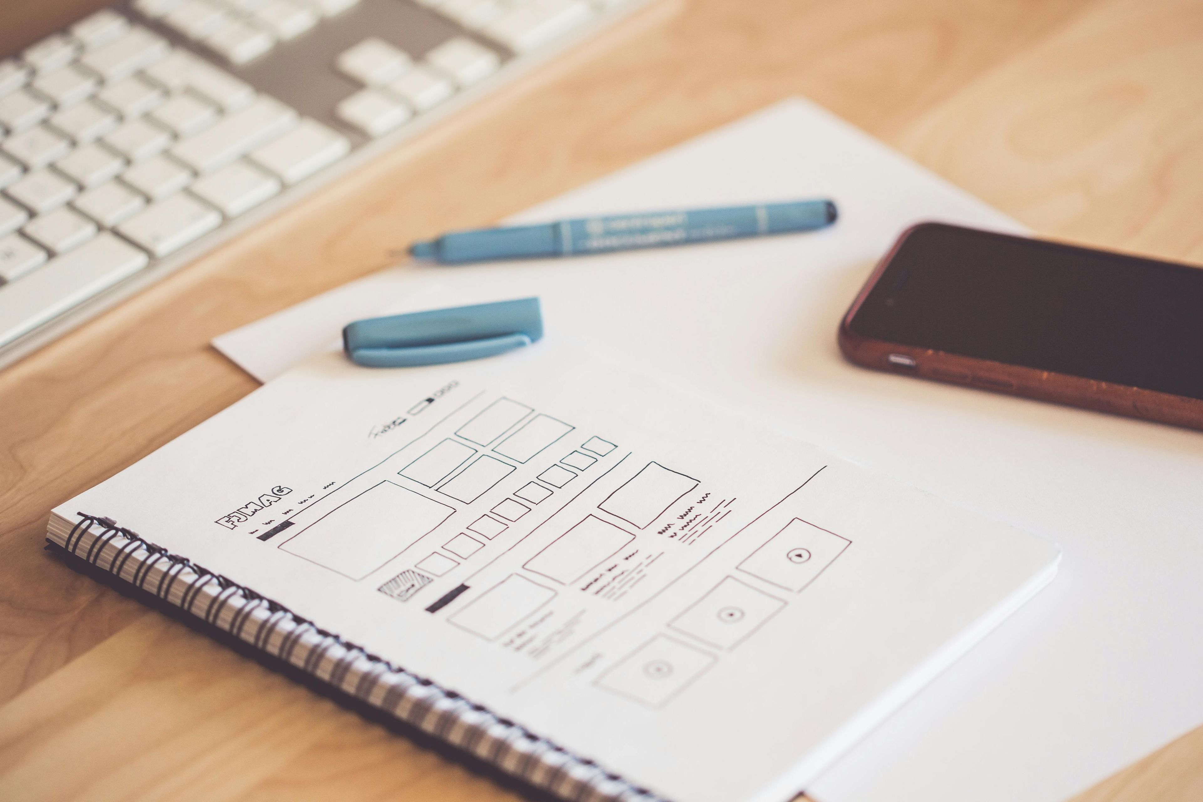
After we’ve created more of these hierarchies, we translate them into sketches. Sometimes we like to do this on paper but most of the times we just work in figma.com. Because we already know what elements we want on what page, we can just position the elements where we’ve placed them in the hierarchy.
Sketches don’t have any color or fancy things, just basic elements positioned on a page. Because we now see how everything looks, we can rearrange some things to make it even more clearer. It mostly comes down to intuition and placing yourself in the users shoes. An interface isn’t static, it can, and should, always change to make life better for the users. The best UX design comes after you’ve launched something and users give feedback on how they want things.
Designing the sketched interface
This involves a lot of User Interface design, so I won’t go in depth, but we basically design the product as it would look when you use it. We also prototype the user flows so you can walk through it as if the web app is already functional. You can leave feedback anywhere you want and we’ll make changes until you’re happy.
“Even experts make errors. So we must design our machines on the assumption that people will make errors” - Don Norman
Great UX doesn’t equal an ugly interface
One thing doesn’t mean the other thing isn’t possible. User Interface Design and User Experience Design are not two opposites on a scale. They both have their own goals and should be combined for maximum results. When you are clear on what problem you are solving and have sketches that highlight the user experience/journey in the product, you are ready to make it look good.
The following design by Vasile Labici demonstrates this. The dashboard maintains a clean and uncluttered appearance despite its numerous features. The strategic use of color and the emphasis on important elements contribute to its clarity and usability. When you look at it, you look at the right things because they are highlighted in the design. An user doesn’t have to think to much about what button to click to get X result.
Benefits of clear UX design
As you can imagine, clear UX is important. When you sell items on a webshop and your webshop doesn’t have a friendly User Experience, you can imagine how much money you would lose from customers who can’t figure it out. The same goes for a SaaS (Software as a Service). SaaS is usually very competitive and it’s hard to get/keep customers. When you don’t have your User Journey figured out, it will cost you dearly. Not only will customer stay but they will tell their friends about your product. They also are more likely to engage with your product and less likely to leave.
Another huge benefit is the development. When your UX is clear from the start, the changes needed, after launch, are almost zero. If you’re the user, the same applies. You don’t want a product that makes it hard to solve the problem you’re trying to solve. Usually these problems get tackled in the feedback fases that we implement along the way and having real users walk through the designs is the best way to build a product.
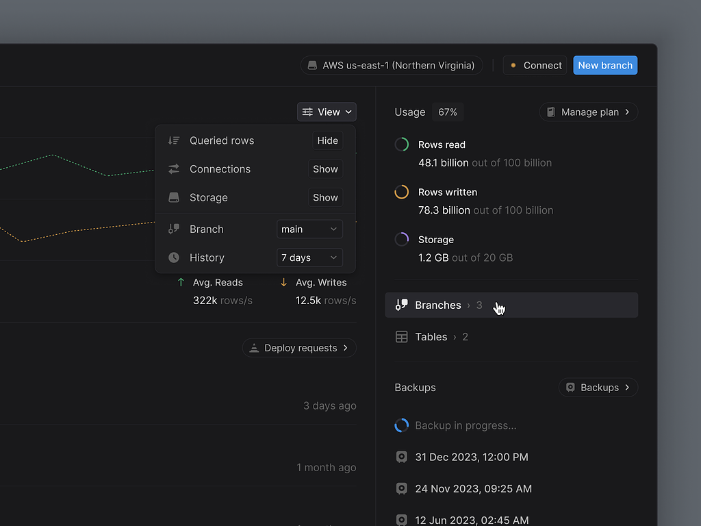
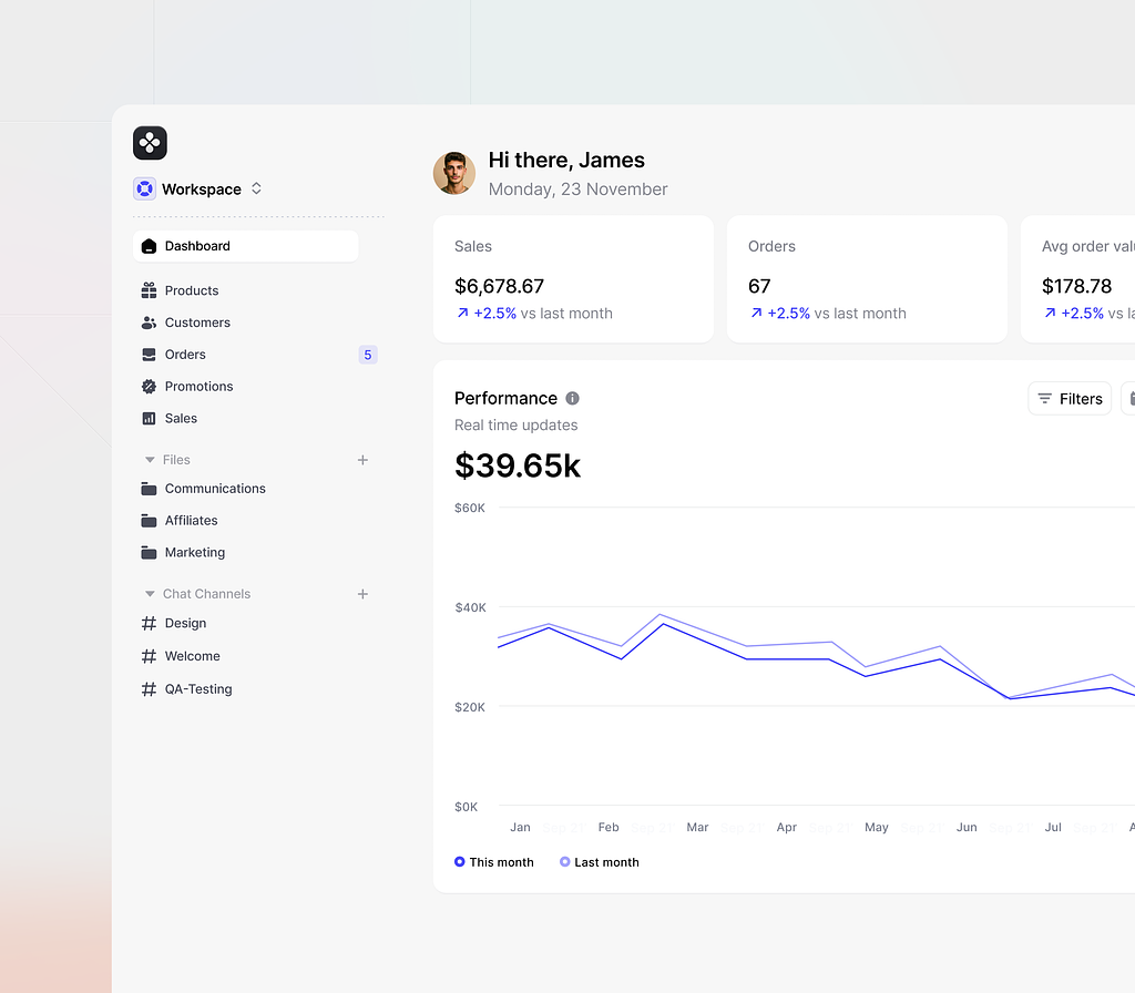
To finish with the example we gave earlier, we’ll look at another one by Monty Hayton. It is also a data intensive dashboard but do you notice the difference?
It only has a few metrics on the dashboard, and those are important. When selling item, you want to know how much sales you made today, how many orders you got this day, how much the average order value is and the performance per month in a graph. Because that is what matters. In the sidebar you see that you still have to fulfill 5 orders. Do you also notice that the graph isn’t on the top, but at the bottom? Why is this? Very simple, to highlight the more important metrics of today.
I hope it is now much clearer what UX is and why it matters.

 Arjen de Vos