User Interface (UI) design is basically the detailing of an interface. Where UX (user experience) design mostly involves figuring out where to put what and how it would make the users life better, UI (user interface) design concerns itself with what color, font, sizes, icons, and more to use to decorate it. Both UX and UI matter.
User Interfaces are the place where users interact with the logic (backend) and expect some kind of result. They are not limited to Graphical user interfaces (GUIs) like a web application; but there are also voice-controlled interfaces (VUIs) like Alexa or Siri and gesture-based interfaces like the Apple Vision Pro.
UI design should be invisible
How can user interface design be invisible as it is what the user sees? It should be invisible like your eyes filter out your nose. People (unless they are designers) don’t care about what color or font you’ve used, they care about how the software can solve their problems. However this doesn’t mean an interface should not have colors/clean fonts etc. Users do care about how an interface looks, it happens unconsciously.
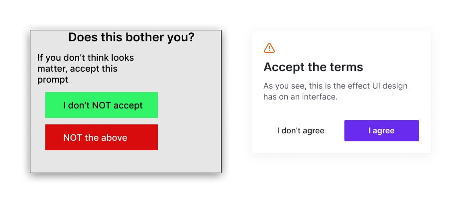
Humans are actually visual creatures, and the aesthetic appeal of an interface plays a significant role in their overall user experience. Even if users don’t consciously focus on the visual design, it subconsciously influences their perception and interaction with the interface. UX and UI work hand in hand when building a software product. If you encounter a negative (like close modal) button that is green and a positive (like accept this) button that is red, how would you feel? This is called dark UX and you can imagine how this could impact your decision.
I hope you didn’t click the wrong button. Doesn’t the second one look more pleasing to the eye?
Predicting behaviour of your users
Predicting user behavior is a crucial aspect of UI design. By understanding how users interact with the interface and anticipating their needs, designers can create a more intuitive and efficient user experience. This involves analyzing user data, conducting user research, and testing prototypes to gather insights into user behavior patterns. If your beta-testing is setup right, most bad UI/UX will be catch in this phase.
For example, if a user frequently accesses a specific feature within an application, the UI design should make that feature easily accessible and prominent. By placing commonly used elements in logical locations and providing clear visual cues, users can navigate the interface more efficiently and accomplish their tasks with minimal friction.
Another popular approach is the use of the keyboard and an accessible command bar, like the Spotlight on MacOS. Users can navigate the entire UI by using shortcuts or by pressing cmd + k and searching in the command bar. This basically eliminates the use of the mouse and means no drag time but it does mean your users should familiarize themselves with your shortcuts. This also means that you should use expected combinations and don’t make them random.
An interface should look consistent
Consistency is another fundamental principle of UI design. Users should be able to recognize familiar patterns and elements throughout the interface, reducing the cognitive load required to learn and navigate the system. Consistent design elements, such as color schemes, typography, and iconography, help create a cohesive and unified user experience.
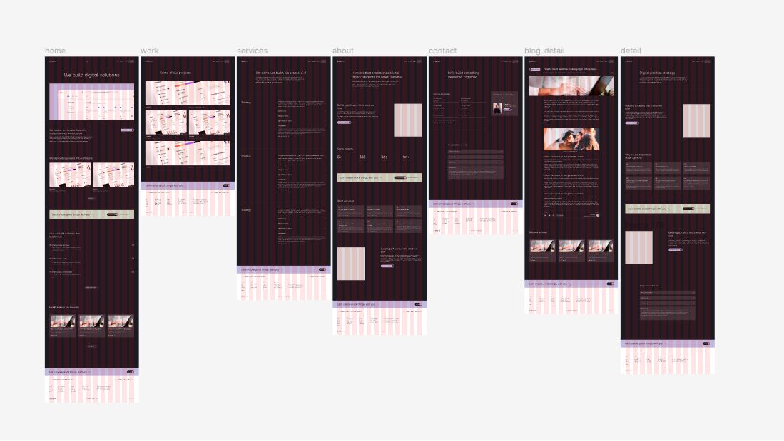
This is achieved by coming up with a design system that defines how the interface looks and feels. A design system includes a style guide that outlines the color palette, font choices, button styles, and other primitive design components. By using these guidelines, you can ensure a consistent look and feel across all screens and interactions.
Consistency also extends to the functionality and behavior of the interface. Users should be able to predict how certain actions will be performed and what the expected outcomes will be. For instance, if a user clicks on a button labeled “Save,” they should expect their work to be saved and not be surprised by any unexpected behavior like a popup (dark UX pattern). Also, you shouldn’t label a button “Update” when you used “Save” on other screens when doing the same action.
Don’t forget accessibility
Accessibility should be essential in UI design. When designing you may not think about it, but there are a lot of people using the internet with diverse abilities and needs. They can have visual impairments, motor disabilities, and cognitive limitations.
There are established guidelines such as the Web Content Accessibility Guidelines (WCAG) that provide recommendations for creating interfaces that are perceivable, operable, understandable, and robust for all users.
Some key accessibility considerations include:
Providing alternative (alt) text for images and non-text content
Ensuring sufficient color contrast between text and background (https://webaim.org/resources/contrastchecker/)
Allowing for keyboard navigation and control (as discussed earlier)
Providing clear and descriptive labels for form fields and interactive elements
Offering captions and transcripts for audio and video content
A design is never finished
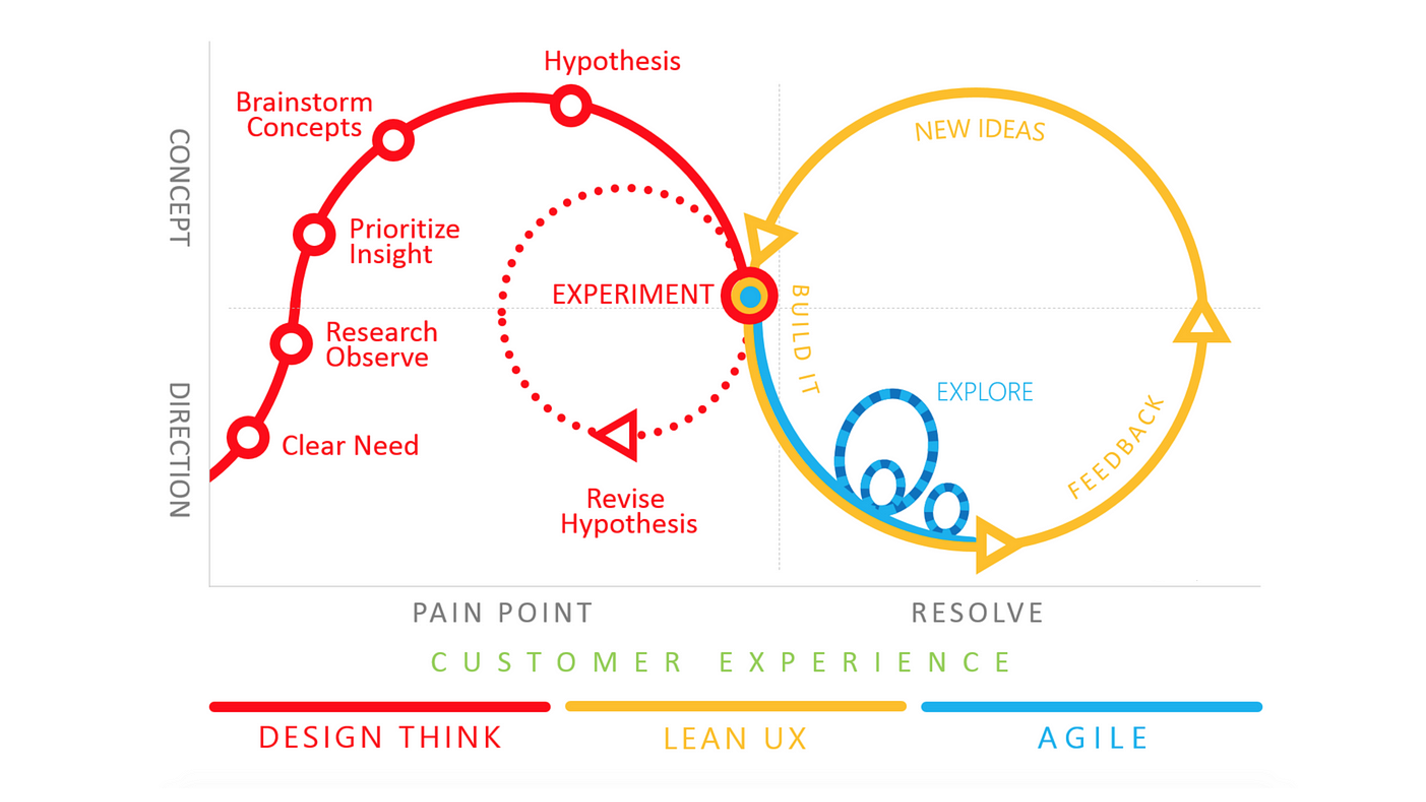
Your product evolves as does your user base. Even if you have quite stable software (core functionality), users will find limitations in your current design that should be solved to make it even better. This is called iterative design. You should always seek input from users throughout the design process to make your product even better.
The iterative design process typically looks like this:
Research and analysis: Gathering user requirements, conducting user research, and analyzing competitor/simular interfaces (and feedback from their users).
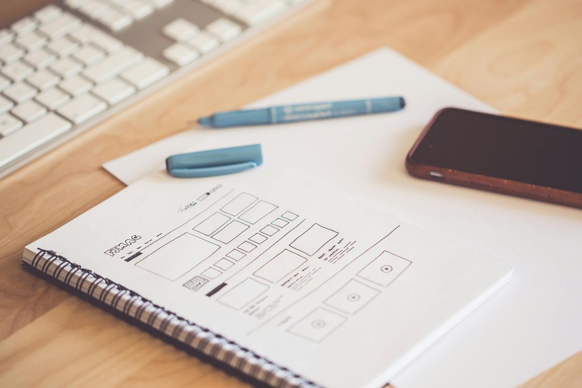
Ideation and sketching: Generating ideas and exploring different design concepts through sketches and wireframes.
Prototyping: Creating interactive prototypes to simulate the user experience and test the feasibility of design solutions.
User testing: Conducting usability tests with real users to gather feedback and identify areas for improvement.
Refinement and iteration: Incorporating user feedback and making necessary adjustments to the design based on the insights gained from testing.
This should continue even after your product is being used by people. Especially if your goal is to get more users (SaaS), you should listen very carefully to your users. But don’t overdo it, don’t build every feature, or any change someone want. Users don’t always know what’s best for them. Do you research, ask more users, beta test the feature/change, and watch if users actually use it after you’ve released it.
Final word
Don’t confuse UI and UX; they are separate concepts but are used together. User Experience (UX) cares about the overall user experience, creates users journey’s, gathers user feedback, designs user flows, and translates this all into a sketch or wireframe. User Interface (UI) design cares about the overall look and feel of the interface while following the UX sketches and wireframes.
UI design usually starts with a design system that outlines the color schemes, typography, iconography, space sizes, and more. With a strong design system, designing a software product is just a matter of coloring the UX sketches and polishing the entire interface with the right font, right sizes, right spacings etc. You should watch out for dark UX patterns and follow accessibility guidelines to make sure that everyone can use the software product.
Hopefully this was useful and I would say, till the next one!


 Arjen de Vos